FLIP Brand Identity, App, and Portal Design
Project: End-to-End Brand & Platform Design
Client: Mercury Studio
Role: Creative Director / Brand Designer / UX + UI Designer / Content Lead
I led the complete design and creative direction for a new digital platform — developing every visual and experiential element of the brand from concept to launch.
Starting with a blank slate, I created the brand’s visual identity, logo, and design system, ensuring a cohesive look and feel across all channels. I designed the mobile app interface, crafted the admin portal experience, and defined the overall UX structure to make both the front-end and back-end intuitive and consistent.
Beyond design, I also contributed to the brand’s voice and content strategy — shaping the tone, messaging, and key user flows. The result was a fully integrated brand ecosystem that connects users, administrators, and the business under one unified, engaging experience.
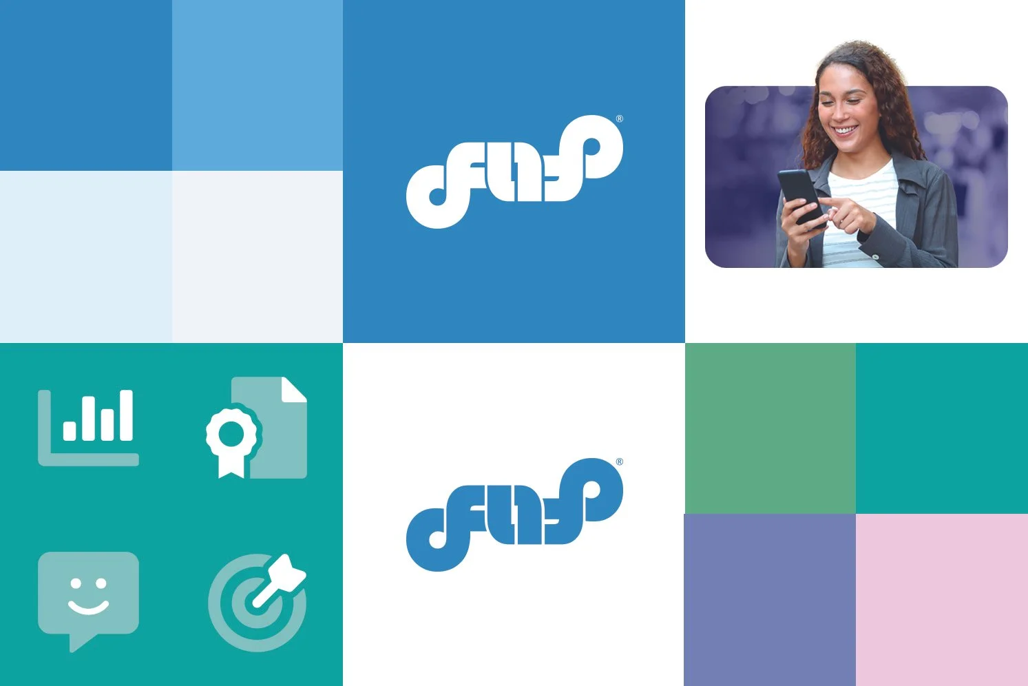
For FLIP, I wanted to create a brand identity that felt modern, approachable, intelligent, and visually memorable while still reflecting the core idea of the platform itself — quick, engaging, mobile-first learning through digital flashcards. The logo was designed with movement and interaction in mind. I intentionally created the typography so parts of the logo visually “flip,” almost like rotating cards or panels, which tied directly into the app’s functionality and name. That subtle sense of motion gave the brand a unique visual hook while reinforcing the user experience.
When developing the color palette, I chose bright, energetic blues and greens to create a feeling of innovation, clarity, growth, and accessibility. The blue tones help communicate trust, technology, and intelligence, while the greens introduce energy and positivity. I balanced those brighter colors with soft neutrals and light backgrounds to keep the interface feeling clean, modern, and easy to navigate.
The icon system was designed to feel simple, friendly, and highly scalable across the platform. I created icons that visually aligned with the rounded geometry and approachable feel of the logo itself, helping the entire ecosystem feel cohesive whether users were interacting with analytics, certifications, assessments, communication tools, or learning goals.
Typography played a major role in establishing the tone of the brand. I selected modern, highly legible fonts that felt clean and digital-first while still maintaining personality. Since FLIP exists heavily within mobile environments, readability and simplicity were extremely important across both large headlines and smaller UI elements.
I also helped define the lifestyle imagery and visual direction for the brand. I wanted the photography to feel authentic, optimistic, and human-centered — showing real people engaging with learning and technology naturally in everyday environments. The imagery was designed to reinforce the idea that FLIP makes learning more approachable, flexible, and engaging.
Beyond the logo itself, I developed the full brand ecosystem for the company. I applied the branding across the app interface, website, social media campaigns, marketing materials, presentations, print collateral, and promotional assets to ensure a consistent visual identity everywhere the brand appeared. I produced all final production-ready assets and created a comprehensive brand guide that outlined logo usage, typography, color systems, imagery standards, iconography, spacing, and overall visual direction so the company could maintain consistency as the platform continued to grow.